Design Statement
The interaction design, visual design, color choice, and everything else at first glance seems unofffical and incomplete, but the reason for that is purposful. Skyloft, the location I chose for this website, comes from the Nintendo game, Legend of Zelda: Skyward Sword. Skyward Sword originally came out in late 2011 on the Nintendo Wii. As the game was developed for the Wii and in 2011, many of the color choices, texture choices, model choice, and other graphic decesions were focused on playful colors and textures with as little variation as possible.
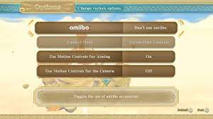
I mirrored those choices in the website as a way to pay homage to the game and all its visual downfalls and buggy interfaces. If I had a better understanding of how to format the looks and actions of buttons, I would have designed them to represent the buttons within the game as pictured here.
The choice of color and text was also made as an attempt to match the choice within the game and beyond that the Zelda franchise. Major focus points are primarily in dark greens like the hero Link, or in shades of blue/purple like Princess Zelda is usually dipicted wearing. After colors for emphasis, faded oranges/off yellows are the most common color for text in Zelda games. I originally had a brighter color that better matched the text as shown in the image above, but I decided to go darker so that I cold create a simple gradient for the background to represent the sky where Skyloft resides. All in all, every choice, besides the design of the buttons, was made with the intent to call back to a game made 11 years ago.